
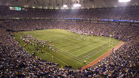
Tonight's primetime Colts-Ravens matchup isn't just a must-see because it's an intriguing matchup of two great teams. It's yet another opportunity to admire my favorite pair of end zones in the NFL (that's right, no aspect of stadium design is too esoteric for this blog to evaluate).
The end zones at Lucas Oil Stadium (which really ought to be called the Oilfield) employ two design elements that I love: copious amounts of color and a distinctive font. The bold blue with the white Colts lettering is particularly nice-looking in an age where most FieldTurf end zones feature boring green backgrounds. If you don't have to worry about natural grass browning or being mowed, why not spend the money one time to paint your synthetic end zone?
Because Seattle is the only other team in the NFL to have a colored end zone, all of my other favorites come from the college ranks. The gold standard is Tennessee's checkerboard in Knoxville, which is as signature to that program as Rocky Top (read a cool article about the guy who paints those checkerboards here). I'm also a fan of Florida State's strikethrough lettering, USC's colorful, bold block design, and the diamond-studded end zones at Virginia.
As for the worst end zones in football? That has to go to Heinz Field, hands down. The clashing end zones feature a yellow "Pittsburgh" at one end (which isn't even written in the cool Steelers font), and plain white hash lines at the other end. Perhaps this is some half-hearted shout-out to Notre Dame, but your guess is as good as mine.
No comments:
Post a Comment